When an input field looks like a button.
So you’re coding an input field and realize that they basically both look the same. This is not ideal since it is not immediately apparent to a user which is an input field and which is not.

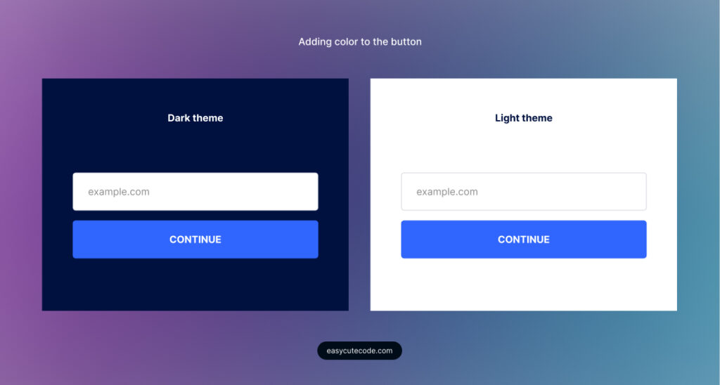
Differentiate using colour.
Adding a primary colour to the button is an easy way to make the differentiation.

Differentiate without colour.
What if we don’t have a distinct primary colour or want to use white & black?
Or what if our primary colour is white, or this is not an essential action on the website, and therefore, we’d want to make it less prominent? Then how would we differentiate the two?
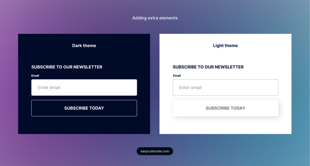
Instead of colour, we can use outlines on either the button or the input, preferably the button. This works on the dark UI.
The light UI requires a different approach from the dark. We could add a shadow on the button and optionally remove the button outline.

Bonus tips…
There are more ways to make it even more concise depending on the use case, for example;
- Adding a label to the input,
- Adding a form heading like ‘subscribe.’
- Adding a hover effect on the button.
- Using a descriptive button title.

Related articles
You might also be interested in these articles.
